
Excess Baggage
Is There Room for Families in the Global Labor Trade?
An Investigative Report By: Neal Rothleder, Journalist, Email, Alex Park, Journalist, Email, Heather Krause, Chief Data Scientist, Email
CHAPTER ONE
THE ROLE OF DATA
While the text, audio and multimedia versions of “Excess Baggage” have some interesting takeaways from Orb’s own data analysis, we also wanted to provide a “data version” of the story. In this section you will find information about the data we used, the preparation and analysis we did, and additional charts and text on the most interesting findings. We present additional contextual statistics about migration from around the world and with respect to the particular countries we visited. We also dive deeply into the educational achievements of teen immigrants and how that achievement differs from their native peers.
As in all Orb stories, there are a few things we hope to achieve by having data analysis and reporting working in conjunction. First, we select datasets across a global backdrop to help our journalists’ exploration of the topic. The data and the analysis should be credible and transparent enough that it can be treated as an informed source by our editorial team. We also want to leverage the credibility and quality of existing studies and data sources to provide a useful context for understanding some of global characteristics of family migrants. The goal of our data analysis is background and perspective – not research-focused, mathematical studies. And finally, in an effort to look not only at a high level across many countries, our data team explore one topic more deeply – that of teenage student children of immigrants and how they fair in their new countries educational systems.
The terms immigrant, native, and nonimmigrant can be ambiguous when characterizing people in this discussion. We use the terms native and nonimmigrant interchangeably, although we admit there is ambiguity and corner cases (For example, how should we refer to a person born in Rome, raised in the Philippines, and then returned to Rome. This person is not an Italian citizen. Is she a nonimmigrant?”) Most of the data used in this story counts anyone born in a different country as an immigrant.
The effect of labor migration on families and youth is a massive topic, so narrowing the focus early was essential to our process. Fortunately, there is a wealth of data on this subject, especially when we narrow the focus from migration generally to migration that occurs through legal channels. To study the phenomenon, we decided to focus on a single country of origin and then choose two destination countries — one emergent and one established.
The Philippines was a natural choice for the country of origin because it has a strong government but weak employment. Many people take jobs abroad, and state agencies are able to follow their lives abroad with reliable data. The vast majority of migration out of the Philippines occurs through legal channels. Through two agencies, the Philippines Overseas Employment Administration (POEA) and the Commission for Filipinos Overseas (CFO), the Philippine government collects data on departing labor migrants with a higher degree of accuracy than most any other country in the world.
In choosing suitable destination countries, Italy stands out because it hosts the largest Filipino population in Europe. Finland’s Filipino community is small, but it’s growing. What both countries have in common is that they are actively trying to bring in foreign labor, and have created legal channels to make it easy for foreign workers to come in. Further, as developed countries with strong governments, both Finland and Italy collect reliable statistics on immigration, poverty, and education which are made comparable by the Organization for Economic Cooperation and Development (OECD) and the European Union’s Eurostat.
CHAPTER TWO
THE BIG PICTURE
A good place to start understanding transnational migration is to look at where people are going when they leave their country. This data is readily available through the International Organization for Migration, a UN agency, which collects it from national governments. The map below shows countries by the percentage of people who were born in another country (2013 - the most recent year for which data is available). Darker shades indicate a larger portion of the population came from somewhere else:

Among the top countries – those with the highest percentage of the population that are immigrants - we see UAE (83.7%), Qatar (73.8%), Kuwait (60.2%), Luxembourg (43.3%), and Singapore (42.9%).
Among the bottom countries – those with the smallest percentage of immigrant population – we see China(0.1%), Viet Nam (0.1%), Madagascar (0.1%), the Philippines (0.2%), and Peru (0.3%).
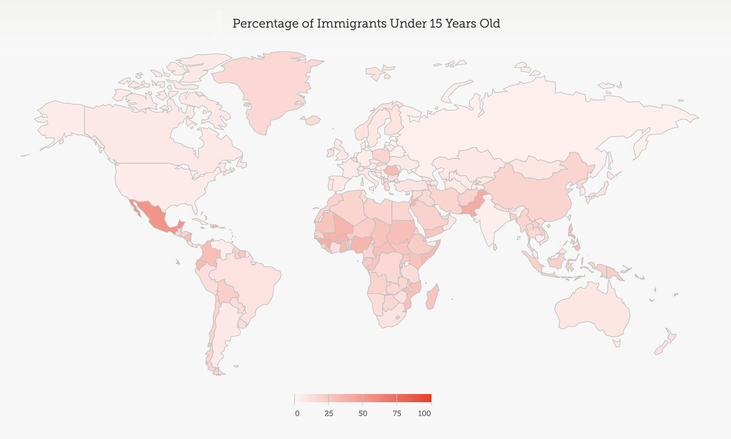
The proportion of these foreign-born populations who are children can vary wildly depending on the country. In Mexico, more than half of all immigrants are under 15. In the United States, fewer than five percent are. The map, below, shows the data around the globe.
Policy is an important part of this story, but without a common metric, it’s hard to compare one country to its peers. Fortunately, the Migration Policy Institute in Brussels and the Barcelona Centre for International Affairs have developed a scoring system to compare specific criteria of migration policies in 34 European and North American countries. Below are two charts, based on their 2010 report (the most recent report at the time of publication). Higher scores (longer bars) are better. The first chart ranks the 31 countries according to 16 policy criteria that measure the ease of accessing a labor market. Sweden (the highest ranked country), for example, allows any migrant with a residency permit to take any job, whether they are an EU citizen or not. Cyprus (one of the lowest ranked countries), bars non-EU citizens from working in the public sector, and denies them unemployment benefits, even when they pay taxes.

The second MIPEX chart ranks countries based on a score of 37 policy criteria related to the ease with which a migrant can reunite his or her family. Higher scores (longer bars) are better. Among the various criteria, countries increase their score by providing migrants a clear justification if their family members’ immigration applications are rejected, and then offering the chance to appeal. Offering no chance of appeal outside the court system nets a country a lower score. With scores of 70 and 74 out of 100 possible points, Finland and Italy rank relatively high by these measures. This doesn’t mean it’s easy to bring a family together in these countries —it’s just easier than some of the other countries in the EU and North America.

In many countries, even rich ones, immigrants are disproportionately poorer than their nonimmigrant peers. Using data from Eurostat, the European Union’s statistics office, we measured the proportion of foreign-born and native children living in poverty, and ranked these countries by the gap between them. Some countries, like Spain, have a high child poverty rate overall, but child immigrants are far more likely to be poor than nonimmigrant children. Spain’s neighbor, Portugal, exhibits a similarly high poverty rate for nonimmigrant children, but immigrant children are only slightly more likely to be poor. Five of the European countries we looked at have child immigrant populations that are statistically less likely to be poor than their native peers.

CHAPTER THREE
A DEEPER DIVE INTO EDUCATION AND STUDENT IMMIGRANTS
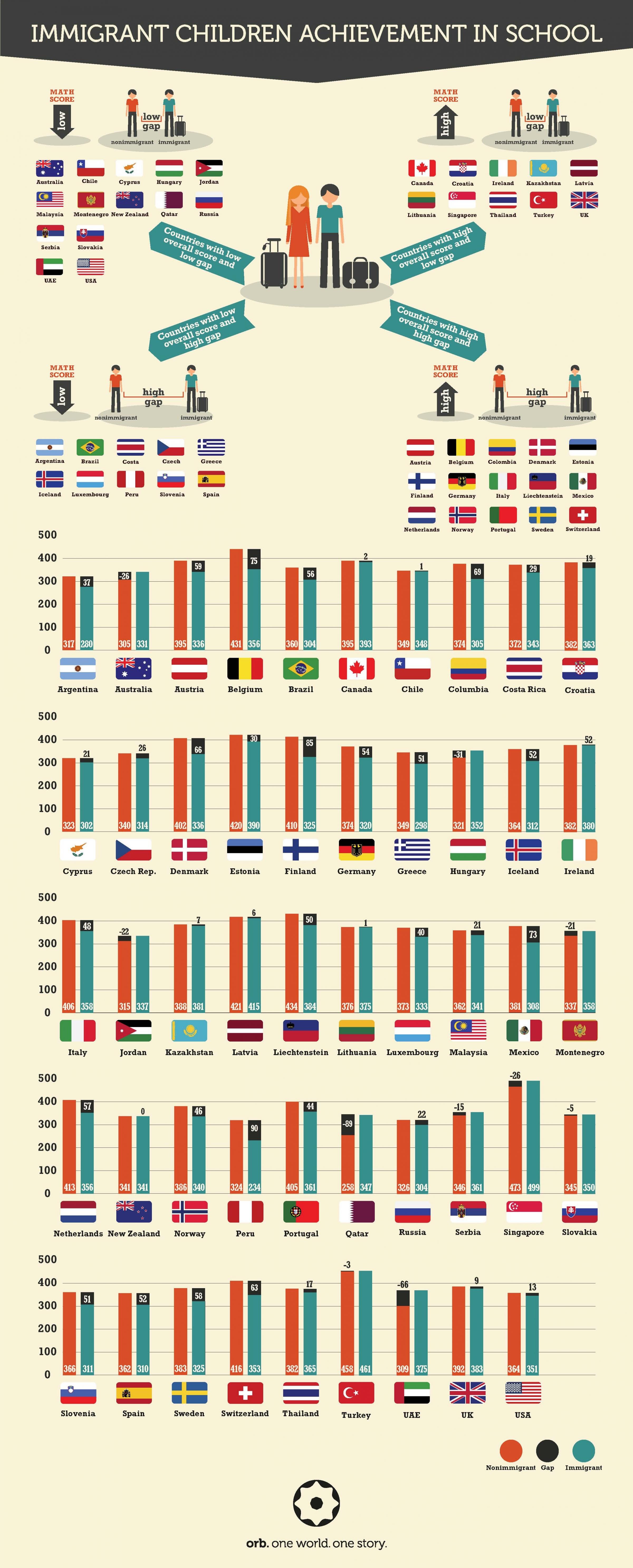
As part of our investigation of the children of global labor migrants, we wanted to understand how well immigrant children do in school, and how their performance differs from their native peers. The Organization for Economic Cooperation and Development’s (OECD) Program for International Student Assessment (PISA, 2012) is a good baseline for asking these questions.
Every three years, PISA conducts an international survey aiming to evaluate education systems globally by testing the skills and knowledge of 15-year-old students. More than 70 economies have participated in the assessment overall. The most recently published results are from the assessment in 2012, and that includes over 500,000 students. To understand the scoring, and our analysis that follows, here are some relevant specifics:
The PISA performance scale for mathematical achievement for each subject is standardized to have a mean of 500 points and a standard deviation of 100 points – across OECD students. That is, across OECD countries, an average student score is 500 and about two-thirds of the students in OECD countries typically score between 400 and 600 points.
245 points separate the highest and lowest averages that exist between country averages.
300 points is the maximum amount separating the highest and lowest performing students within county.
The PISA scores are designed for comparative analysis rather than stand-alone analysis – to compare countries over time, say, or to compare gaps between different subgroups of students. There is no such thing as a pass or fail on the PISA.
Immigration status is self-report in the PISA survey. In this analysis, we group both first-generation and second-generation immigrants together. First-generation immigrants are students who were not born inside the country of the test and whose parents also were not born inside the country of the test. Second-generation immigrants are students born in the country of the test, but who have both parents born in other countries.
In our data analysis, we focused on two key metrics:
1. Achievement: Overall scholastic achievement in math for the 15-year-old sample population of PISA. That is, we look at how well students are generally performing in math, by country.
2. Gap: Difference in scholastic math achievement between immigrant 15-year-olds and their native peers?
We capture this as:
Gap = (Native achievement score – Immigrant achievement score)
In this way,
Positive gap scores indicate native teens have higher achievement than their immigrant peers.
Negative gap scores indicate native teens have lower achievement than their immigrant peers.
Larger positive or more negative scores (i.e., scores further away from zero) indicate a larger gap between the two populations.
Scholastic achievement in math was chosen because it is the subject of focus in the most recent PISA data.
We explored these metrics across the OECD countries captured in the PISA data, and looked further at three interesting variations and factors:
Changes over time – How have the key metrics (Achievement, Gap) changed between 2003 and 2012?
Language and Socioeconomic status (SES) – How do countries score on the key metrics (Achievement, Gap) if we control for both the difference in immigrant/native language and the general SES of the countries.
Mother’s Educational Achievement – A strong correlation has been observed between a child’s educational success and the overall educational achievement of the child’s mother. How does the Gap between immigrant and native students change when we control for students’ mother’s educational achievement.
ANALYSIS #1: BASELINE OF ACHIEVEMENT AND GAP, 2012
To get an overview of the baseline PISA survey data, we start by looking at two figures: Achievement and Gap. The map below shows the Gap (2012) measurement for the OECD PISA countries.

The following graph shows these two key metrics in a two-dimensional scatter plot. The horizontal X-axis shows the average Achievement score, while the vertical Y-axis displays the Gap. The two solid lines capture the averages of the countries included in the analysis.

Some simple interpretations of the graph:
Countries to the right of the graph have higher Achievement scores. Singapore, Lichtenstein, Switzerland, and Netherlands are among the countries furthest right in the chart with the highest average Achievement scores.
Countries to the left have lower Achievement scores. Peru, Qatar, Columbia, and Jordan are among the lowest.
Countries towards the bottom of the graph have a smaller (even negative) Gap score and thus have immigrant students performing more competitively to their in-country peers. In some of these countries (those with a negative Gap score), immigrant students outperform their native peers. Qatar, UAE, Hungary, and Australia are among these.
Countries toward the top of the graph have immigrant students performing more poorly in comparison to their in-country peers. Peru, Finland, Mexico, and Belgium have particularly large gaps.
It is interesting to view the two metrics together, and interpret the graph by dividing it into four “quadrants”:
Countries towards the lower-right of the graph have students with above-average Achievement scores, and a below-average Gap (immigrant students are closer, or performing better, than the average of their in-country peers). These are good circumstances for immigrant students – they are close (or ahead) of their native peers in system of students performing well. Clear examples in this part of the graph include Singapore and Australia.
Countries towards the lower-left of the graph have students with below-average Achievement scores, and below-average Gap (immigrant students are closer, or performing better, than the average of their in-country peers). Clear examples in this part of the graph include Jordan, Montenegro, and UAE.
Countries towards the upper-right of the graph have students with above-average Achievement scores, and above-average Gap (immigrant students who are performing below average compared to their native, in-country peers). This is an interesting group of countries. Immigrant students are not doing as well compared to their in-country peers. However, because overall Achievement scores are high, in some cases the immigrant students still have higher Achievement scores than many other countries. In other words, their “local” performance may look poor, while their global performance might be good. Clear examples in this part of the graph include Finland, Switzerland, Belgium, and Liechtenstein.
Countries towards the upper-left of the graph have students with below-average Achievement scores, and above-average Gap (immigrant students who are performing below average when compared to their native, in-country peers). These are not good circumstances for any student, but clearly the immigrants are doing particularly poorly. Clear examples in this part of the graph include Peru, Columbia, and Mexico.
Finally, the infographic below presents the above information in a more qualitative, illustrative way. It is a more accessible way to see Achievement scores and Immigrant/Native Gaps around the world.
ANALYSIS #2: CHANGES IN GAP SCORES FROM 2003 TO 2012
Given a baseline understanding, the next analysis looks at these achievement Gaps over time. We compared PISA study data for 2003 and 2012. Just as in 2012, math was the focus for the 2003 PISA survey (so comparing values and gaps in achievement is more meaningful). We are interested in understanding which countries changed status with respect to math school achievement and immigrant/native gap.
Interestingly, while the overall average gap across OECD countries made a significant change in this time period (dropping 10 points), the Gap for most countries did not change by a significant amount between 2003 and 2012. Only three countries have seen significant changes in the achievement gap between 2003 and 2012: Switzerland, United States, and Australia. Even though these changes are statistically significant, they are small.
| Country | Gap, 2012 | Gap, 2003 | Change in Gap (2012 – 2003) |
|---|---|---|---|
| Australia | -26 | 1 | -27 |
| Switzerland | 63 | 74 | -11 |
| United States | 13 | 36 | -23 |
ANALYSIS #3: ACHIEVEMENT AND GAP SCORES, ADJUSTED FOR SOCIO-ECONOMIC STATUS AND LANGUAGE DIFFERENCES.
When comparing immigrant student Achievement to their native, same-country peers, two of the more obvious likely influences are socio-economic status (SES) and language differences. Data shows that generally speaking immigrant children have a higher poverty rate than their native peers (The Multimedia version of this story discusses this further.) Further, in many places, immigrant students either arrive speaking a different language than the natives, and/or continue to use that language at home (typically with family). The PISA instrument captures (via survey questions), whether the language that students most often speak at home is the same or different than the language used for the test (the primary language spoken in the country). Do these challenges contribute to poorer immigrant student performance? If so, to what degree?
To address this, we repeat the overall view from Analysis #1 (above), but we adjust for the differences in poverty and language. That is, we want to try and understand how the achievement Gap might change if poverty and language barriers are accounted for. To do this, we use multivariate regression to combine the estimates of association across all these key variables. The resulting estimates of association are called adjusted or controlled estimates. In other words, when we simply look at the relationship between math achievement and country, we are looking at the unadjusted or marginal relationship between the two variables. For this analysis, we build a multivariate model that takes into account several variables and generates a parameter for each variable. In this way, we are looking at an adjusted or conditional relationship between two variables (with language, immigration status and SES being the adjusting variables in this case).

By comparing this data with that show in Analysis #1, we see some interesting differences:
Generally speaking, for most countries, the size of the mathematics achievement Gap falls once we adjust for differences in SES and language. Countries such as Belgium, Luxembourg, Austria, and Netherlands see their Gap change by over 30 points each. While cause and effect cannot be determined from this data, it makes intuitive sense that language and SES are closely tied to student performance
For most countries, the adjusted Gap between natives and immigrants remains statistically significant. That is, language difference and poorer SES do not completely account for the Gap between native and immigrant students.
Three countries stand out when we analyze the results of this adjustment. Argentina, Portugal, and the USA all have statistically significant achievement Gaps that favor native students; however, those Gaps become insignificant once we adjust for SES and language differences. That is, for these three countries, immigrant student math achievement is on-par with their in-country, native peers when we adjust for language and SES differences. Further investigation is needed to try to unravel this further.

For most countries, the MES adjusted Gap is lower than the original achievement Gap. That is, once we factor in MES, immigrant student performance gets a bit closer to native student performance. The change is not large, however. The largest changes in achievement Gap that occur when we adjust for MES are in the 25-30 point range.
One simplistic hypothesis is that immigrant mothers have a lower educational status – affecting the achievement of their children in new country. However, we do not have the data or first-hand accounts to confirm or refute this, and there are many other potential factors and explanations.
Looking at specific countries highlights a few interesting data points:
Among countries with the largest change in Gap – those for whom MES seems to be a bigger factor – are Luxembourg, Germany, Netherlands, Iceland, and Greece.
Among countries with the smallest change in Gap – those for whom MES does not seem to be a significant factor – are Estonia, Russian Federation, New Zealand, Latvia, and Israel
Peru is the country with the largest original Gap. The MES-adjusted Gap is very similar (90 original, 86.6 MES-adjusted).
Three countries move from a significant Gap to an insignificant one when MES-adjusted. That is, the original achievement gaps for Hungary, Malasia, and the United States are all statistically significant. However, when we adjust for MES, the differences between native and immigrant students are insignificant for those countries.
CHAPTER FOUR
CLOSING
As with many topics, collecting and preparing data at a global scale is a challenging and interesting endeavor. In this story on migration, Orb collected many sources and used the source guidance and our own data science skills to prepare and analyze that data. We were careful not to inappropriately link or fuse sources or draw unsupported conclusions. Our results are designed to be correlative and informational. Even with these limitations, we see an informative picture of migration – including identifying global hot-spots and policy implications. We did a deep dive into the topic of educational performance of immigrant teens and how their achievement differs from that of their native peers. Overall, there is has been little change in either math Achievement or the Immigrant/Native Gap over the years 2003-2012. Language differences, socioeconomic status, and mother’s educational status all play some role in the educational success of immigrant teens. Causes and effects are difficult to determine in the limited exploration we did, however, and we look forward to collaborating and participating with partners and other community members to understand these data insights at a deeper level.
CHECK OUT MORE STORIES ON THIS TOPIC
The #longread version of Excess Baggage